
- English
- 日本語
About the Observability pages
Last updated 2025-03-28
You can use the Observability pages in the Fastly control panel to monitor your Fastly CDN and Compute services.
Before you begin
Be sure you know how to access the web interface controls before learning about the details you'll encounter here.About the Observability pages
When you click Observability in the navigation sidebar, the Account Summary page appears by default. The Account Summary page provides a high-level overview of all your services.
To access additional Observability pages, go to Observability in the navigation sidebar and select one of the following options:
- Services menu: provides access to the Service Overview page, which displays top metrics for a Fastly service, and the All Services page, which displays aggregated metrics for all of your services.
- Domains page: provides real-time and historic visibility into detailed response data for traffic from your domains and subdomains to Fastly.
- Origins page: provides real-time and historic visibility into detailed response data for traffic from your origin servers to Fastly.
- Insights page: provides insights based on stored log data for your Deliver service, allowing you to proactively identify trends, optimize performance, and troubleshoot and debug issues.
- Logs menu: provides access to the Tailing and Explorer pages, where you can view log data for your services.
- Alerts menu: provides access to the Overview, Definitions, and Integrations pages, where you can view current and historical alert feeds and configure alert definitions and integrations.
- Custom Dashboards page: where you can view and manage custom dashboards that surface relevant metrics for a Fastly service.
The exact graphs displayed on the Observability pages depend on your access permissions and the type of service you create, as well as other products and features you may have purchased.
The data on the Observability pages may also appear grayed out or blank to some users, with no information displayed in the controls, when a service hasn't yet received enough requests for Fastly to display meaningful information about it.
About the controls on the Observability pages
Observability pages use a number of control types to best display information.
TIP
Looking to rearrange charts or change their names? Check out custom dashboards for details.
Common dashboard controls
Many Observability pages share similar controls to help you manipulate and refine the information displayed on any dashboard.
To the right of each dashboard's name, these controls may appear:
- the Alerts link, which opens the Alerts firing window. From this window, you can view firing alerts.
- the Options menu allows you to display event markers (vertical lines) on the charts to signify when a new version of a service was activated. With appropriate permissions, it also allows you to edit a dashboard name, clone a dashboard, delete it, copy a link to it, and export the data from the dashboard to a CSV file.
- the Service configuration link opens the service configuration page for the service selected in the dashboard.
- the Create dashboard button allows you to create a custom dashboard.
Immediately below a dashboard's name, these controls may appear:
- the Service menu allows you to specify the service that the metrics are drawn from. From the menu, you can search for a service by ID or name.
- the Region menu allows you to limit the displayed metrics on any dashboard to a specific region around the world.
- the Data Resolution menu allows you to select how the data is represented for the defined time range.
- the Time Range menu allows you to change the timeframe over which metrics will be displayed and to change the time zone from Coordinated Universal Time (UTC) to the time zone identified by your browser. By default, the system displays 1 days worth of static data. The selected timeframe and time zone persist as you navigate between dashboards.
- the Live button (which only appears on dashboards for specific services, not the Account Summary dashboard) allows you to change displayed metrics to live data that changes in real time. When viewing the live data stream, the time axis will scroll even if there is no data. You can click Pause to pause the live data stream.
Sorting and filtering controls on charts
Some charts, especially those that could potentially display a large number of items, contain sorting and filtering controls that allow you to prioritize which items are viewable first.
For example, the 5xx by Origin chart on the Origins page could potentially display a large amount of data. To mitigate this, a filtering menu allows you to select the 5xx status codes to display.
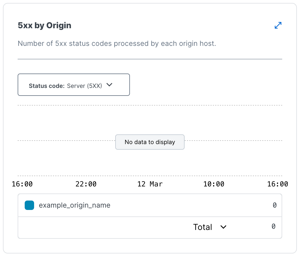
Similarly, if you were to hover your cursor over a specific origin name in that same chart, additional controls would appear to the right that allow you to limit the displayed data in that chart to just that one origin, without having to choose the origin specifically from the Origin menu below the dashboard name.

Controls that provide additional details about charts and metrics
Timestamp indicators. Hovering over any part of a graph displays a timestamp indicator that updates as you move the cursor along with a service version indicator.
Chart value selection menu. A summary menu at the bottom of many charts allows you to view the total, maximum, minimum, mean, latest, and 95th percentile values of for the metrics displayed when appropriate. By default, percentile charts display the mean value while other charts display the total. The summary menu for percentile charts does not include the total metric.
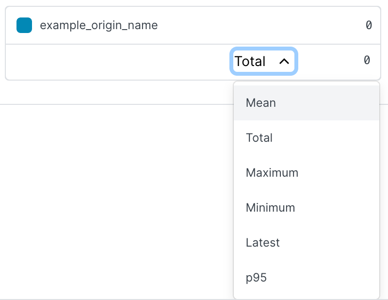
Chart expansion. You can click expand in the double-headed arrow ![]() in the upper right corner of a chart to access a Metrics Details page focused on specific information about the metric being tracked.
in the upper right corner of a chart to access a Metrics Details page focused on specific information about the metric being tracked.
A details page typically displays:
- the expanded metrics chart.
- a summary table that automatically updates the total, maximum, minimum, mean, and 95th percentile values for a metric based on the timestamp that you're hovering over on the expanded chart.
- a table that displays the total for the metric over time.
When a Metrics Details page appears with a map instead of a chart, expanding that map will provide additional high-level, metrics-specific details about regions on that map (e.g., requests per second and bandwidth details for a specific region on the global POP traffic map for a service).
Links between related data. Some charts may have relevant data in other areas of Observability. For example, on a 5xx metrics chart, you can click the line segments symbol ![]() to the right of the chart name to go directly to the Insights page related to that chart.
to the right of the chart name to go directly to the Insights page related to that chart.
About the Account Summary page
The Account Summary page provides aggregate metrics for your account for the last two weeks:
- Requests: the total number of CDN and Compute requests aggregated across your account.
- Bandwidth: the total amount of bandwidth served across all services in your account.
- Error ratio: the average ratio of error responses (4xx and 5xx) to the total number of requests across your account.
Links to your latest alerts and custom dashboards are listed at the bottom of the page. Alerts and custom dashboards are disabled by default.
About data latency
When working with dashboards and the metrics they display, keep the following in mind about data:
- We do not report data for time periods that have not yet ended.
- Data with
dayresolution is bucketed based on UTC days and each day's data becomes available around 2am the following day. - Data with
hourresolution buckets becomes available approximately 15 minutes after the end of each hour. - Data with
minuteresolution buckets usually becomes available two minutes after the end of the minute, but can take up to 15 minutes to appear.
If your use case requires data closer to real-time, consider using the generally available real-time API instead.
IMPORTANT
You cannot retrieve minutely historical statistics data older than 35 days from the current date. You cannot retrieve hourly historical statistics data older than 375 days from the current date. Contact support to discuss your minutely or hourly data needs.
What's next
Dig deeper into details about all areas of the web interface before you move on to working with services.Do not use this form to send sensitive information. If you need assistance, contact support. This form is protected by reCAPTCHA and the Google Privacy Policy and Terms of Service apply.
